

Whether you’re presenting to a small group of stakeholders in a board room or addressing a large audience at a conference, you’ll need to know some things in order to be an effective presenter. We’ve already covered verbal communication skills in our last installment; today we’ll consider the content you will likely be creating to accompany your presentation.
A presentation could be nothing more than you speaking, but it’s much more common to have some accompanying visual aids. In the older days, that might have been a chart or concept diagram. Today, it means slide content, which is most frequently created and rendered with Microsoft PowerPoint (or a similar tool like Keynote). Slide content can include text and/or media (images, video, audio). This is a subject full of strong opinions, so prepare yourself for some controversy!
Pervasive PowerPoint
PowerPoint
is pervasive: just as Kleenex is
synonymous with tissue, PowerPoint is synonymous with slide content. If you hear someone say
they “hate PowerPoint”, they most likely mean they hate slide presentations in
general rather than the tool itself (which is quite powerful).
Obviously,
slide content can vary in quality depending on the author: blaming PowerPoint for
a bad presentation is like blaming a kitchen for a poorly-prepared meal. With
that said, we’ll be stuck with using “PowerPoint” interchangeably with “
presentation content” because that’s the common usage.
To PowerPoint
or Not to PowerPoint: That is the Question
As we
mentioned earlier, presentation content is an extremely controversial subject. While PowerPoint is very popular overall,
make no mistake: some people absolutely hate it—or more accurately, they are
opposed to electronic presentation content. If you do an online search for “you
should never use PowerPoint” you’ll get something on the order of 15,000
results!
Why do
some people hate PowerPoint presentations so much? If you peruse the results
you’ll see reasons like these offered:
• You
might have nothing to go with if there’s an equipment mishap.• Overly long slide content bores the audience unlike conversation which can take turns in direction.
• PowerPoint is just a way for poor speakers to remember what to say instead of memorizing it.
• Some people relate much better to your narrative than to your visuals (different learning styles).
• Poor presentation content is rampant, and results in an excruciating experience for audiences.
In my opinion, it’s the last point—not using PowerPoint effectively—that’s at the heart of the “don’t use PowerPoint” movement (humorously illustrated here). That doesn’t make tools like PowerPoint bad, any more than bad font and layout choices make word processors bad.
Here are some things to avoid in your presentation content:
1. “Slideuments”
2. Typos
and Grammatical Errors
3. Poor
Layout, Color, and Font Choices
4. Overdoing
it
5. Lack
of Consistency
6.
Matching visual content and spoken content word for word
7. Not accommodating different learning styles
8. Failing to realize what you don't do well
Bad #1: Slideuments
A “slideument” is an
overloaded presentation where the slides are stuffed with so much content that
it resembles a document more than a presentation. Cramming all the information
you can into your slides will render them incomprehensibly dense. It’s too much
for the audience to absorb and usually results in small-size text with little
white space. Remember, you can always provide a link to a follow-up resource
such as a document or web site that provides more detail. Here’s a slideument
slide example:
Example of a Slideument
DON’T
turn your content into a “slideument” by overloading it.
DO think about the highlights or take-aways you want your audience to remember.
DO think about the highlights or take-aways you want your audience to remember.
Bad #2: Typos and Grammatical Errors
There’s
no easier way to cast doubt on yourself than to have sloppy slides that you haven’t
checked for typographical and grammatical errors. Also check for repeated words
or omitted words, and incomplete sentences.
Example of Typos and Grammatical Errors
DO pay attention to PowerPoint warnings and have someone else proofread your content.
Bad #3: Horrendous Layout, Color and Styling
Poor
layout and style choices will paint you as an amateur. Good layout and
strategic use of white space can set a presentation apart, but that cuts both
ways. Odd choices of typefaces and font size are rarely gong to work in your
favor.
For a
presentation in a meeting room, font sizes under 14pt should be avoided: smaller
text is hard for many people with older eyes to read. In a conference setting
you don’t’ even want to go that small as some people are likely a sizeable
distance from the display.
It’s
amazing how many otherwise good presentations are defeated solely due to the
choice of color, killing any chance of the audience making out the content.
Avoid light on light (such as yellow text on a white background) or dark on
dark (such as dark grey on a black background): go for contrast.If you don’t have strong sensibilities in this area, find a good-looking template and stick to it like glue.

Example of Poor Layout and Font Choices
DO use a template or content author with sensible layout, fonts, and color choices.
Bad #4: Overdoing It
There
are oodles of perfectly good features you can use in a PowerPoint presentation
that are fine as long as you don’t over-use them or intermix too many different
kinds. This applies to text effects, image effects, and animations. Be
especially careful not to over-use transition animations: a little goes a long
way! You’ve probably seen home videos made on a computer where the person doing
the editing decided to use a different transition method between every scene
(fading, wiping, closing circle, etc.): was the result an enhancement to the
content or a distraction? ‘nuff said. Restraint and subtlety are the watchwords
of every good content author.Example of Using Overly-Fancy Transition "Vortex"
DON’T over-use effects that distract from your content rather than enhancing it.
DO exercise restraint and subtlety in your animations, transitions, and other effects.
Bad #5 Lack of Consistency
Consistency
is a necessary ingredient in a successful presentation content: not using a
consistent style for titles, bullet points, and so on throws people off and
distracts from your content. In a consistent presentation, the audience quickly
locks on to the style and looks past it to focus on the message.

Example of Inconsistent Use of Typeface and Size
Bad #6: Matching Visual Content to Spoken
Content Word for Word
Let’s be
candid: depending on the speaker and the subject matter and the volume of
information to be shared, you may or may not be able to remember everything you’re
supposed to say. Go to a large audience setting like a conference and you’re
doubly likely to become absent-minded right when it counts.
For this
reason, a great many people put everything they need to say in their PowerPoint
deck. The result is a word-for-word match between what’s on the screen and what’s
being said. This is a very bad move: you need to convey more with less
visually. The purpose of your slide content is to serve the audience, not the
speaker.
Focus on
key concepts and take-aways in your visuals, including important phrases, photos,
or diagrams. Let a picture speak a thousand words. As long as you have the high-level
reminders you should be able to recall the details; you can put the full
content in the speaker notes, and then practice presenting until you have the
details memorized.
Example of Word-for-Word Slide Content
DON’T use
visual content as a teleprompter for the speaker.
DO design visual content to assist the audience in comprehension.
DO design visual content to assist the audience in comprehension.
Bad #7: Not Accommodating Different
Learning Styles
One
reason some people object to slide content is, not everyone has the same learning style: some
people are visually-oriented, some auditory, and some tactile in nature
(whether they know it or not). Auditory learners would rather listen than watch, and if you can’t convey your message verbally they’re
turned off by your reliance on something visual.
If
you’re meeting with one person, you might tailor your means of communication to
their preference (if you know it); when addressing a group, you should assume a
mix of learning styles. When you have both visual and auditory people in the
audience (the majority of the population), it’s vital that your presentation
and narration work equally well so that you are simultaneously satisfying the
visual people as well as the auditory people. Moreover, your visual and verbal
content should not be identical: reading your slides word for word is likely to
turn off the entire audience. Give the visual and verbal take-aways in the way
most natural for each medium: for example, an engaging story you might tell
verbally might need nothing more than a picture in its visual counterpart.

Make sure you are communicating with all kinds of people
DON’T
rely on visual-only or verbal-only presentations.
DO communicate effectively to both the visual and auditory members of your audience.
DO communicate effectively to both the visual and auditory members of your audience.
Bad #8: Failing to Realize What You Don't Do Well
It's tempting to want to emulate techniques of other successful speakers, such as telling jokes or including great graphics. However, you should not do this if you don't do it well.Everyone loves humor in a presentation. How much should you do? It depends on how well you do comedy. If you're a rock star, throw humor throughout your presentation. If you're okay in small doses, dole out an ice-breaker. If you're terrible at humor, stay away from it completely--or rely on purchased content such as a cartoon or humorous photo.
Likewise, graphics matter but don't create your own graphics if the result is amateurish-looking. Instead get help from a person or tool or online service. Seriously, it's better to leave it out if it isn't pristinely done.
The content author who knows their strengths and limitations gives the more effective presentation.
Now that we know what not to do, what’s the right way to do an effective PowerPoint presentation? The good news is, there’s plenty of adivce online from people who have the answer; the bad news is, they don’t agree with each other! Depending on who you listen to, a perfect PowerPoint presentation uses one of these approaches (note the lack of agreement):
• The
Takahashi Method: slides contain a handful of words with very large text or
an image, total number of slides is often 10 or less. The audience is forced to
listen to the speaker since much of the content is not in the visuals.
• The
Lessig Method: slides contain just a short phrase, quotation, or image,
delivered rapid-fire in sync with the speaking. The total number of slides may
be quite large. The fast pace keeps the audience from becoming bored.
• The
Godin Method: slides complement the message with complementary visuals with
striking images, bold text, contrasting colors.
• The
Monta Method: slides frequently contain questions that are posed to the
audience, then answers are revealed after hearing audience guesses. The
audience is kept engaged as participants.
• The
10/20/30 Rule (Kawasaki Method): the 10/20/30 rule of PowerPoint is, 10
Slides, Delivered in 20 minutes, with on fonts smaller than 30-point type. It
comes from a venture capitalist and has those kinds of presentations in mind.
Which is
the right answer? There is no single best way, for the simple reason that
venues, speakers, and audience are not all cut from the same mold. It should be obvious that one size does not fit all.
What works best
for one speaker isn’t necessary good for all speakers. Even the same speaker
might use varying approaches depending on the subject matter, length of time,
and type of audience.
Tips for
a Superior PowerPoint Presentation
We’ve
looked at mistakes to avoid and we’ve heard some different views on the best presentation
techniques. Here are some PowerPoint crafting tips that help grab viewer
attention, clearly communicate your information, and keep you in control. The
list below is an aggregation of tips from several online sources (including Stephanie
Krieger, Damon
Brown) and myself.
1. Select
or create a great theme
2. Use
audio or video to convey your message more effectively
3. Use
graphics to emphasize key points
4. Use
animations and transitions wisely
5. Start
by outlining your presentation
6. Use
masters and layouts to save time and help get better results
7. If
you’re doing hand-outs, consider differences between print and on-screen
presentations
8. Use
notes pages and handouts to help deliver the story
9. Keep
file size manageable
10. Use
the tools available to get it right the first time
11. Turn
off (or manage) AutoCorrect layout options
12. Know
exactly what your views will see.
13.
Choose colors wisely, and remember that part of the population is color-blind.
14.
Bullet points are easier to read than paragraphs
15. Pictures
(and charts and diagrams) speak 1,000 words (if they’re good)
16. Practice
giving your presentation (ideally to colleagues so you can get feedback)
17.
Borrow from the best, and make it your own.
Examples
of Great Presentations
Microsoft’s Scott Hanselman is a great presenter with effective slide content and lots of humor. You can view one of his conference session talks here. Notice how well he and his content work together.
TED presenters are often credited for presentation innovation and great effectiveness. Here are some examples of their presentation content. Though these may not be in the style that works best for you, you can still learn much from them.
• Thirst
Here are
a few slides from the Thirst presentation to give you an idea of what effective
presentation content looks like (no infringement intended, just paying homage).


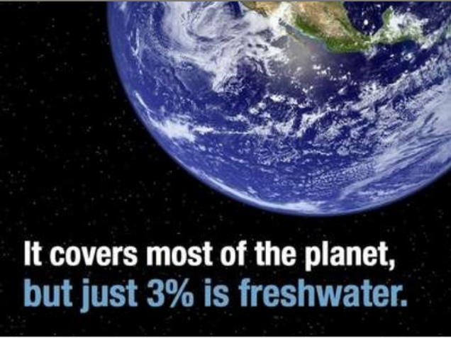
Example Slides from an Effective Presentation
In
Conclusion
If you’re a consultant,
expect to be presenting in front of an audience at some point. It’s not difficult
to develop good presentation content if you stay away from the common mistakes,
emulate or develop a successful style, and work to gain some sensibilities. Your
content needs to look good and it needs to be good. Remember that your content is not the presentation: you are the presentation.
2 comments:
Hanselman on Speaking.
http://www.hanselman.com/blog/VIDEOTheArtOfSpeakingWithScottHanselman.aspx
Hey david, You provided very informative and nice post on how to be a effective consultant. thanks for sharing your knowledge to us!
technical consulting service
Post a Comment